

The Serif Is Back. That Tells Us Something.
An Etsy print I think is cool. Yours for $189.39.
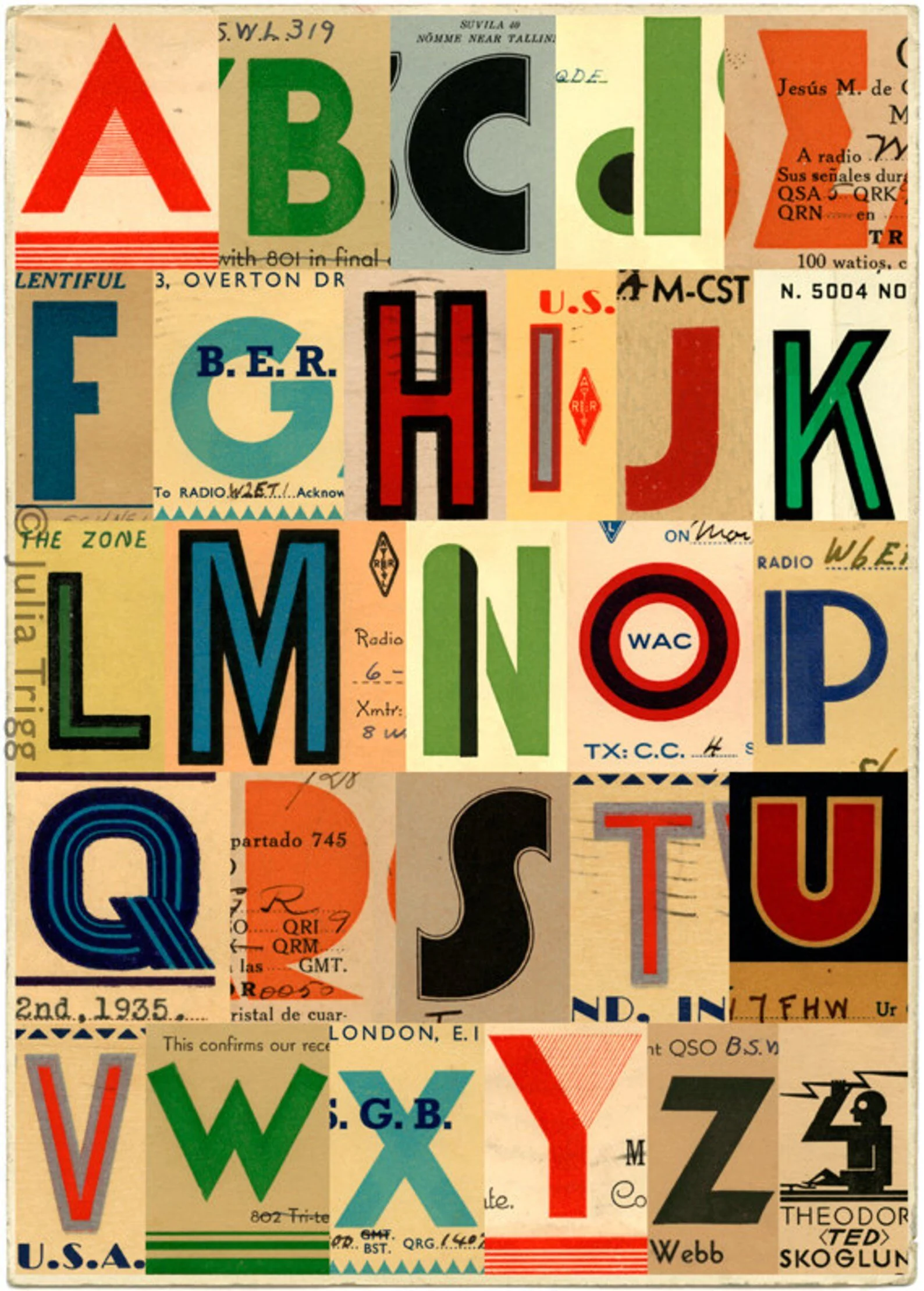
Look no further than this website for evidence.
For about a decade, the sans-serif ruled. Clean, geometric, neutral. Brands dropped their serifs the way they dropped everything that felt fussy or old — chasing a version of modernity that looked great on an iPhone and asked nothing of you.
It worked, until it didn't.
The Century-Long Argument Between Serif and Sans
Typography has always been a battleground between the past and the future, and the 20th century was no exception.
The early 1900s were serif country. Newspapers, advertisements, books, government documents — all set in typefaces with feet, brackets, and weight contrast that traced their lineage back to the Roman inscription. Type was built to last, and it looked like it.
Then came the modernists. The Bauhaus declared that form should follow function, and ornament was a crime. Futura arrived in 1927 — geometric, rational, unadorned — and offered a new visual language for a new century. It promised efficiency. It promised the future. Brands that wanted to signal progress reached for it.
The postwar decades deepened the divide. The Swiss International Style of the 1950s gave the world Helvetica — a typeface so neutral it seemed to have no opinion about anything, which was precisely the point. Corporate modernism embraced it. Airlines, corporations, governments. The logic was sound: a typeface that belonged to no era belonged to all eras.
Through the 1960s and 70s, serif fonts found refuge in books, magazines, and luxury goods, while the commercial and corporate world moved steadily toward the sans. The message encoded in that choice was simple: we are modern, we are efficient, we do not waste your time.
The 1980s and 90s brought a brief serif revival, mostly in print — glossy magazines, upscale retail, the typographic maximalism of early desktop publishing, when suddenly everyone had access to hundreds of fonts and used most of them simultaneously. But the internet reset everything. Screens couldn't render serifs cleanly at small sizes. The web defaulted to sans-serif, and an entire generation of digital-native brands followed.
A Decade of Efficient Branding
By the 2010s, a peculiar sameness had settled over the consumer brand landscape. Hundreds of DTC startups launched with nearly identical visual identities: geometric sans-serif wordmarks, muted palettes, lots of white space, packaging that looked like it had been designed by the same algorithm.
In retrospect, the aesthetic made sense as a cultural artifact. The 2010s were the decade of optimization. Of productivity apps and inbox zero and life hacking. Of Soylent and standing desks and the quantified self. America had developed an almost theological belief in efficiency — the idea that friction was the enemy, and that the right system, tool, or product could eliminate it.
The sans-serif was the visual language of that belief. It removed ornamentation. It streamlined. It asked nothing of the eye except to process information as quickly as possible and move on.
What brands were communicating, often unconsciously, was that they understood your time was valuable. That they wouldn't burden you with history or complexity. That they were, above all, frictionless.
Efficiency Fatigue
But something has shifted.
There's a growing body of cultural evidence that Americans — particularly younger Americans — are exhausted by the optimization economy. The same generation that grew up with Seamless and Spotify and one-click everything is now lining up at farmers markets, buying film cameras, cooking from scratch, and choosing experiences that are deliberately slow and inconvenient. The friction, it turns out, was part of the point.
Brands have noticed. And one of the quietest signals of that noticing is typography.
Serifs are back — and not just on heritage brands dusting off the archives. New consumer brands are reaching for typefaces with a little weight, a little history. Brightland, the olive oil brand, looks like it belongs in a Provençal kitchen circa 1987. Fishwife leaned into vintage serif lettering before tinned fish was a personality. Flamingo Estate reads like a particularly good independent bookshop. These aren't accidents.
Burberry brought back its equestrian knight. Even Mailchimp quietly evolved toward something warmer and more typographically considered after years of functional minimalism.
The theory, if there is one: a generation raised on algorithmically perfect sans-serif DTC branding started to associate that aesthetic with sameness — with the interchangeable, the disposable, the optimized-to-death. The serif signals something different. Slower. More deliberate. Worth keeping around.
What the Serif Actually Communicates
The sans-serif was a signal of confidence through reduction. The serif is a signal of confidence through permanence.
Both work. But they work differently, and for different cultural moments.
The sans-serif says: we have stripped away everything unnecessary. We are modern, minimal, efficient.
The serif says: we have been here long enough to have a point of view. We are not chasing the moment. We intend to last.
For a consumer culture fatigued by the disposable and the optimized, the second message carries real weight. The serif doesn't just communicate heritage — it communicates intention. That someone made a deliberate choice, took their time, thought about what they were building and why.
In a world of frictionless brands, a little weight is a differentiator.
Typography has always been one of the quieter ways a brand declares what it believes about itself. The typefaces brands are choosing right now suggest they believe — or at least hope — that their customers are ready to slow down.
It will be interesting to see which brands were right.
Further reading:
Creative Review — The Return of the Serif (2023)
Something Curated — Why the Coolest Brands Have Fallen in Love With the Serif (2024)
ArtVersion — Serif Is Back: The Return of Character (2025)